10 Tips To Save Money When Buying Fleet Graphics

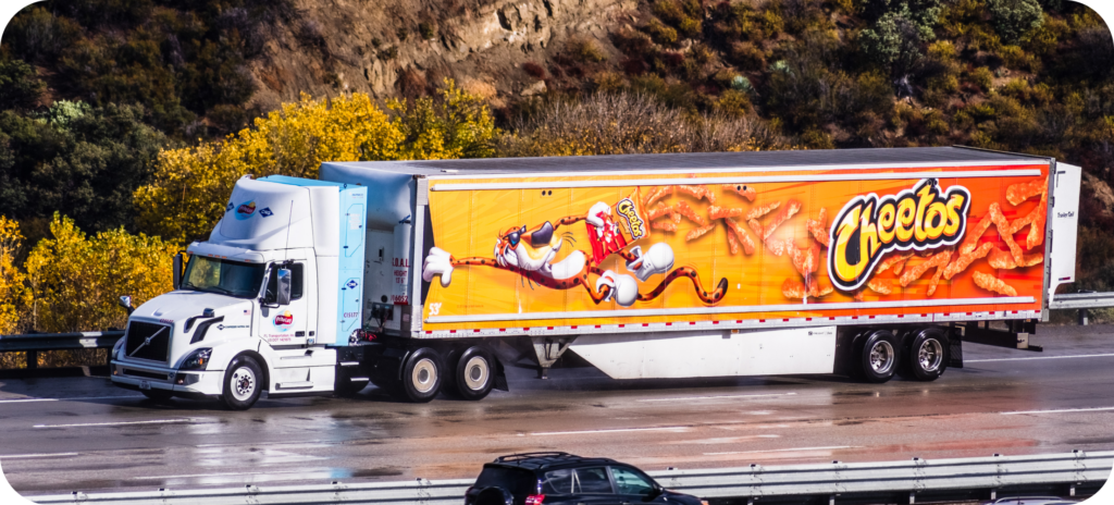
Fleet graphics are inherently one of the most cost-effective forms of advertising, passively driving your message home to millions while you transfer goods.

64% of US drivers notice vehicle graphics
Nielsen Out of Home Advertising Study 2019
One Truck With Fleet Graphics generates an average of 30,000-70,000 impressions per day (10-14 million per year)
“Measuring the Value of Vehicle Wraps” by ARD Ventures
Vehicle marketing results in a 97% message recall, compared to a 19% retention for stationary signage
RYP & Becker Group
Out-of-home advertising generates nearly 4x more online activations per ad dollar than TV, radio, and print
Nielsen March 2017 OOH Online Activation Survey

Memorable fleet graphics have great potential to increase engagement and revenues. Modernistic can provide cost-effective solutions for your next project – further increasing ROI to your bottom line. With fifty years’ experience printing, cutting, and installing major brand vehicle wraps, we’ve developed the following 10 tips to save money on mobile media programs.
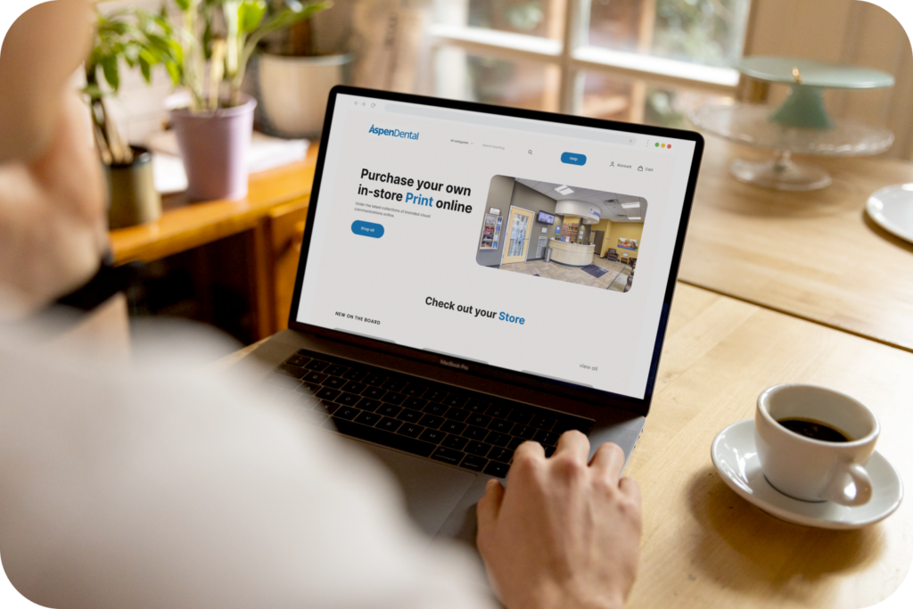
1. Online Ordering

Ordering your fleet graphics from an online portal saves you time and keeps the buying process simple and organized. You can track orders and even let franchisees purchase the fleet graphics they need. Check out our easy-to-use online print ordering system here.

2. Know Your Fleet Graphic Coverage Options!

There are a lot of different graphic coverage options available to fit your budget and advertising goals. With the right graphic, it’s possible to achieve high-quality results that meet your unique business needs. Below is a quick guide.

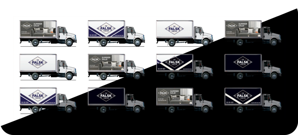
Spot Graphics / Decals

Spot graphics includes simple logos and/or cut lettering to help customers recognize your business.

Partial Wraps

A partial wrap typically covers at least 1/3 of your vehicle makes your company stand out and enhances brand awareness.

Full Wrap

Full wraps allow you to create bold new looks to communicate your brand’s story and capture the attention of your potential customers.

Reflective Accents

Reflective accents are strategically placed to highlight parts of your vehicle visible both day and night.

Full Reflective Wrap

A full reflective wrap provides a dramatic appearance and better visibility no matter what time of day.

3. Utilize The OEM Vehicle Color

Expenses can be minimized by ordering vehicles in the color you plan to use for your fleet graphics and then adding eye-catching graphics! Dialog between fleet graphics managers and vehicle purchasers often miss this no-brainer idea.

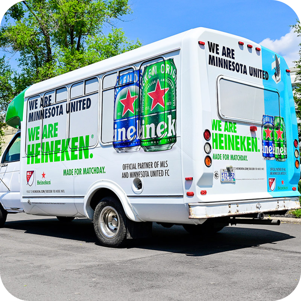
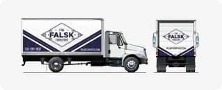
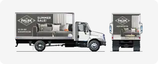
4. Make Your ROI Count By Standing Out

Sometimes you gotta go big or go home! A unique fleet graphic will promote more brand awareness than a simple one. A slight upgrade to design and coverage may dramatically enhance that eye-popping effect. Take time to determine how the desired outcome will best be achieved within the scope of your budget.
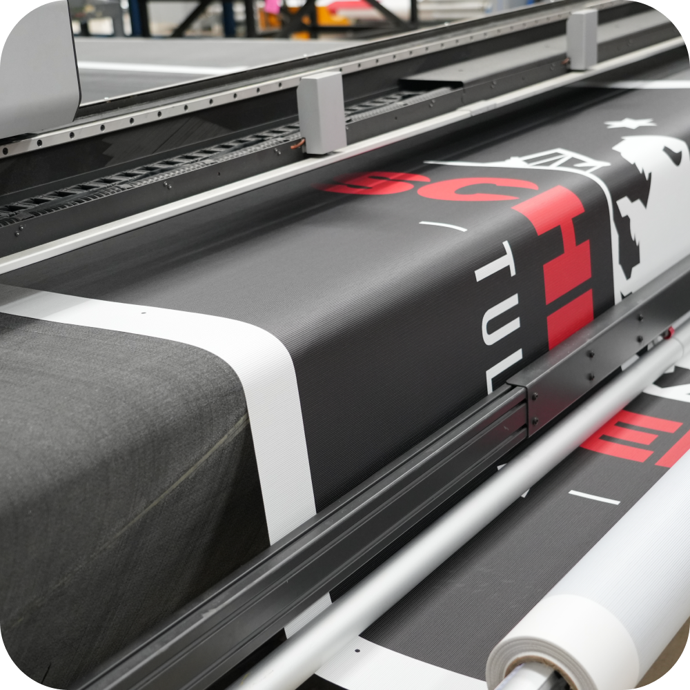
5. Die-Cut Only

A common misconception in fleet graphics is that they must be printed products. This is not the only option! If the material comes in the desired color, we can simply die-cut it to your desired shape. Another great way to save money is to utilize laminates. For example, we applied anti-graffiti laminate on city buses that were constantly being tagged [spray paint]. Once installed, graffitied buses simply go through the bus washing station for removal – saving thousands in repainting costs.

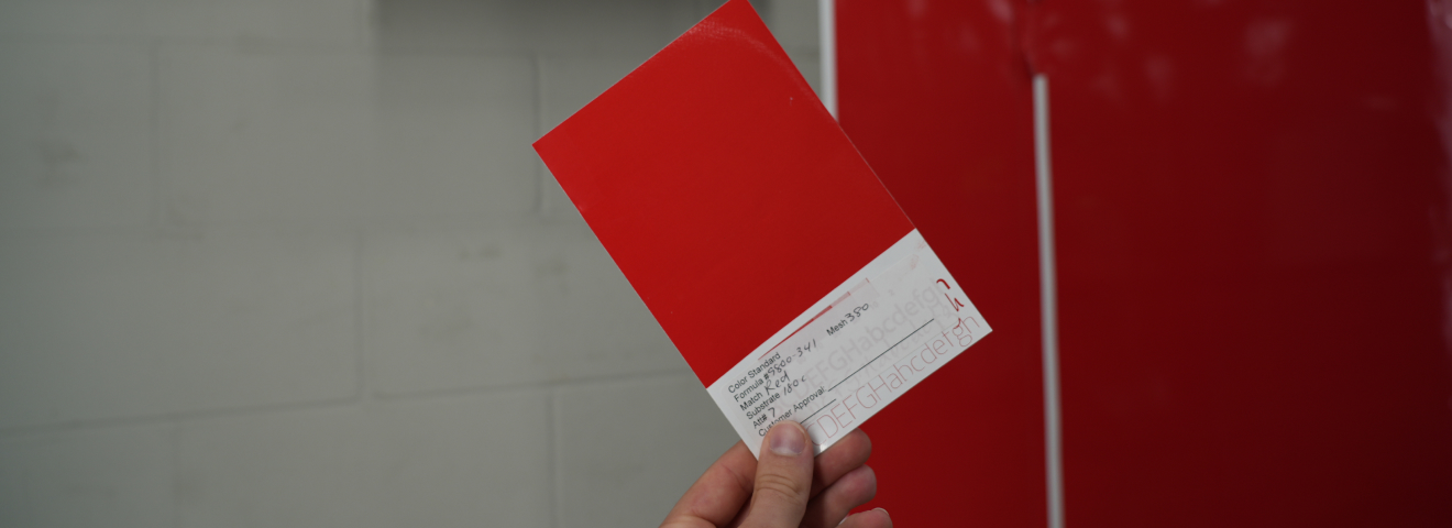
6. Choose The Right Fleet Graphic Material

There are thousands of fleet graphic materials, film types that you can get lost in. We examine the application and the expected service life of your graphics to properly determine what substrate and process should be utilized. The risk of selecting the wrong material is not only a loss of time and money but could damage your brand’s reputation. When you’re talking about the essence of a company’s brand, the performance of a material is of the utmost importance.
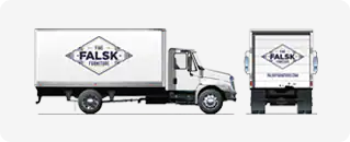
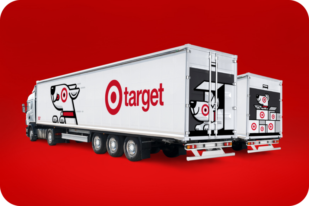
7. Efficient Design

As is true in any marketing program, efficient foundational design can reduce the total cost of a project. In the example below, partial graphics are utilized on a white trailer, however, it gives the appearance of a full wrap. This not only reduced costs for the client but by utilizing creative art, their brand awareness intensified and resulted in improved ROI.

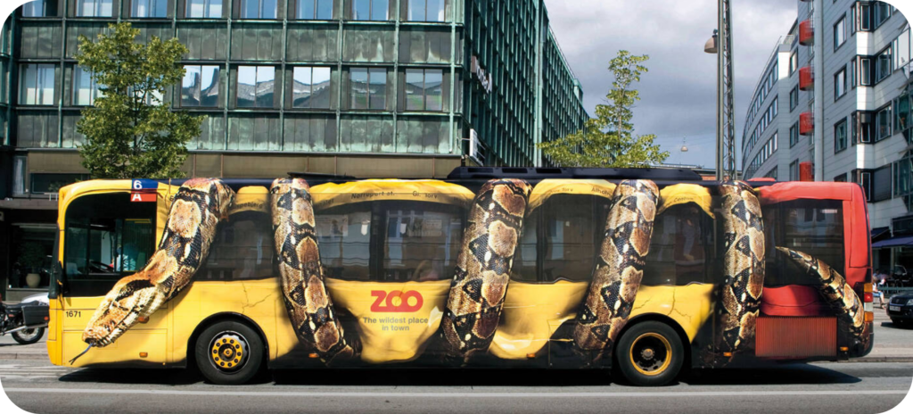
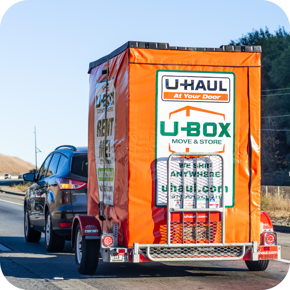
8. Think Outside The Box

Let’s face it; this is an overused business cliché. But the principles it stands for – approaching problems in innovative ways, conceptualizing problems differently, and understanding your position in relation to any particular situation – is our goal with every project.

Don’t overlook approaching a fleet graphics project with a unique idea. Below is an example of a creative solution, printing on banner material for a large scale, durable portable storage container fleet graphic campaign.

9. Design With Safety In Mind!

50% of traffic deaths happen at night – National Safety Council
Visibility decreases by 95% at night – U.S. Department of Transportation Federal Highway Administration

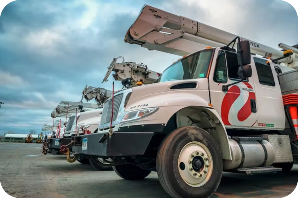
Creating a culture of safety with your fleet graphics is more than reducing hazards; doing so can also increase morale and productivity, and decrease insurance premiums for your business. We have helped hundreds of fleets implement this by manufacturing and installing reflective graphics, keeping drivers safe and their brand at the top of mind, no matter the hour. For reflective best practices, we highly recommend reading the U.S. Department of Justice’s Study on Emergency Vehicle Visibility and Conspicuity.

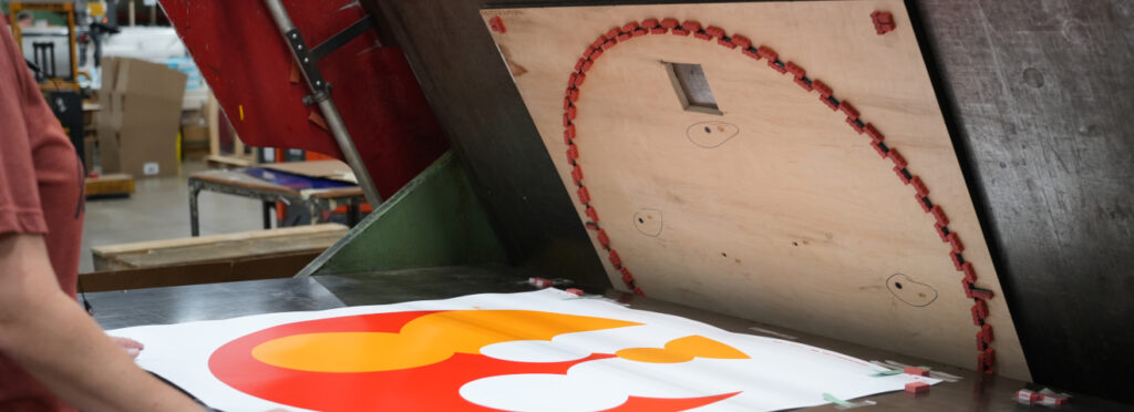
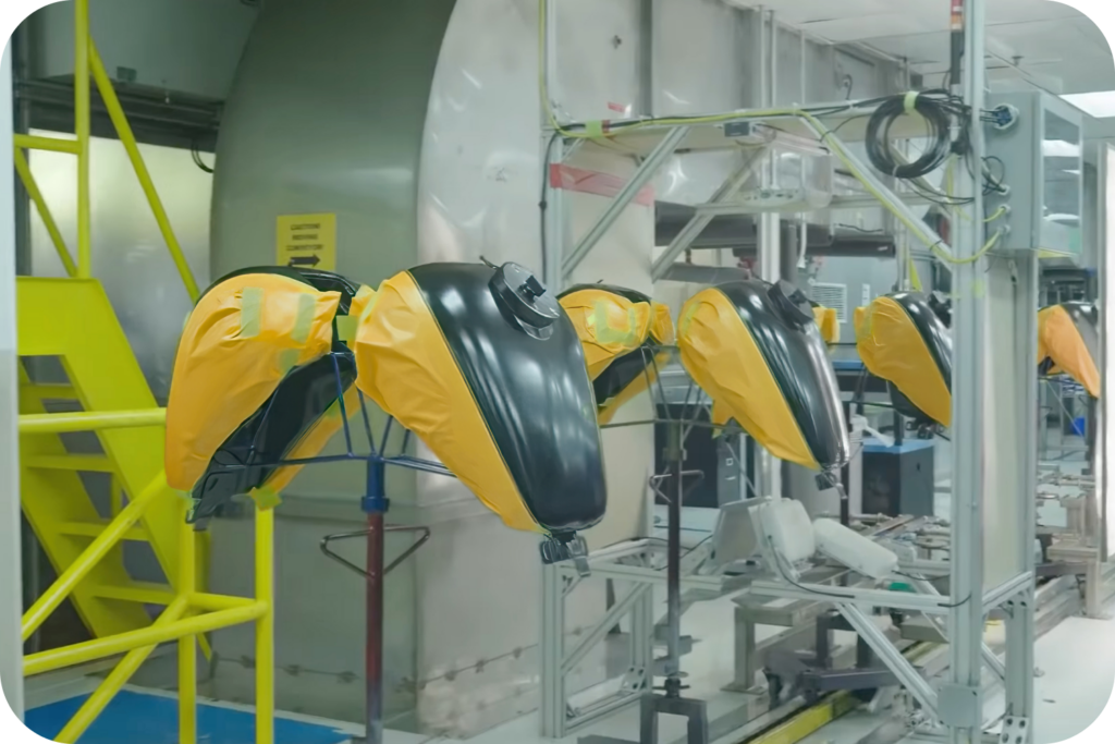
10. Curveball! Custom Paint Masking

There are times when a printed/cut fleet graphic isn’t the most practical solution. Custom paint masking can improve your bottom line if you have a paint process, need extreme durability, deploy a high quantity of vehicles, or utilize a complex painting assembly. Here’s a great example of how we helped save a motorcyle brand millions of dollars through our custom paint masking.

Grow your company’s revenue while personally enhancing your career! Fleet Graphics are awesome, but they take more than good artwork or a well-structured design to entice a consumer to buy a product. It’s a balanced recipe of great design, affordable manufacturing cost, clever placement, and judicious use of resources. Stay tuned for next month’s knowledge drop to learn more!

On the other hand, if you can’t wait or want to cure your fleet graphics issues RIGHT NOW – click here, and we’ll talk today!

19 Lies You’ve Been Told About Holiday Displays

It is no secret that the print industry is vast and extremely unique. We have been in the business for 85 years and we are still learning!

While not always intentionally misleading, you’re often absorbing content from:

Printers who have limited capability: Most printers don’t have screen and digital printing capabilities which can lead to biases.
Marketers without much print experience: Marketers wear multiple hats and juggle numerous projects at once; it would be unreasonable to rely on them to know everything!
Non-practitioners: Printers who don’t invest in R&D themselves, but pass along (sometimes outdated) printing insights they’ve read online.
Outdated Information: Technology and capability change every day. Capabilities that weren’t possible yesterday, could be possible today.

After running thousands of holiday display prototypes for brands like Target, Kohls, and other major retailers – here are 19 myths you may have been told about holiday displays.

1. Graphics Have To Be Dimensional To Look 3D

False. You can utilize creative shading or special effects to make 2D parts look 3D! This is a helpful guide to creating the illusion of depth.

2. It Is Expensive To Screen Print Or Do Specialty Effects

False. Screen printing can be more affordable than digital printing. Plus screen printing gives you special effects capability and expands the color range (if you can see it with your eye – we can color-match it). That is why a quote from Modernistic includes screen printing and digital printing options.

3. You Can’t Print Fragrances or Scents

False. When you incorporate scent into your print media, a heightened emotional engagement occurs. This is proven to increase consumer recall, redemption, sales, and brand value. Read our Beginner’s Guide to Scented Printing to learn more.

4. Holiday Graphics Can’t Be Applied On The Floor

False. We make floor graphics that go indoors, go outdoors, glow in the dark, and even anti-slip graphics!

5. Your Display Needs To Be Printed

False. If the material comes in the desired color, we can simply diecut the material to the chosen shape! You could also use a laminate or even cut vinyl and apply it to your part instead of printing! Here is a great story of how we were able to create 15,000 dimensional bats with JUST cutting in under 72 hours.

6. Shiny Metallic Prints Are Expensive And Scratch

False. Metallic or chrome prints can be just as durable and affordable as other standard inks and laminates.

7. A Corrugated Box Can’t Be A Display

False. With a little creativity, anything is possible.

8. Holiday Graphics Can’t Be Applied Onto Stairs

False. We are huge advocates of attention-getting graphics placed nearly anywhere.

9. Christmas Trees Can’t Be Printed

False. It’s 1,000 times false. Printed Christmas trees are the best! Granted, we are a bit biased.

10. Christmas Trees Aren’t Able To Ship Flat

False. We design every holiday-themed display (including Christmas trees) to ship efficiently. Want more info – read our 3 tips cut down shipping time/cost.

11. There Are A Limited Amount of Christmas Tree Shapes

False. We have printed, fabricated, or cut out hundreds of different shapes and sizes of Christmas trees. Literally, the possibility for shape, dimension, material, and size are endless. For example, here are 400,000+ different shapes from Shutterstock.

12. Your Holiday Display Needs To Use Traditional Colors

False. According to a PR NewsWire study, Only 47% of consumers chose to decorate with styles considered traditional.

13. It Is Impossible To Have Floating Graphics

False. Floating graphics is our passion. We can take your vision and create an easy to install fixture.

14. You Should Not Add Light To Basic Substrates

False. Common substrates (FalconBoard, Sintra, PETG, etc.) can be backlit and look just as cool as fabric and acrylic!

15. You Must Choose Between Dimensional Graphics Or Shipping Flat

False. It’s all in the initial design/construction – our specialty!

16. Don’t Get Too Abstract With Your Holiday Display

False. Sometimes abstract is just what you need to stick inside the buyer’s mind!

17. You Can’t Put Holiday Graphics Onto An Escalator

False. Are you getting the theme yet? We think graphics can go anywhere!

18. Holiday Store Hour Clings Should Be Simple

False. Add some Christmas pizazz with our quick turnaround window clings and window graphics.

19. It’s Difficult To Find A Supplier That Can Do Special Effects

False. As one of the largest screen printers in the country, we take pride in our special effects printing. From distinctive textures and unusual substrates, to fragrance and metallic colors – we do it all! Here are some of the special effects we offer.

Grow your company’s revenue while personally enhancing your career! Visual communication is awesome, but it takes more than good artwork or a well-structured design to entice a consumer to buy a product. It’s a balanced recipe of great design, affordable manufacturing cost, clever placement and judicious use of resources. We are here to help!

5 Spellbinding Tricks to Halloween Point of Purchase (POP)

Over the last 15 years, Halloween has become a major cultural event and has grown to be the second-largest commercial holiday in the country. According to the National Retail Federation, consumers spent approximately $9 billion on Halloween in 2019. Even during COVID, when spending was down, the average amount spent on Halloween items was $92 per person. This means, consumers are not only willing to spend, but they are actively looking and seeking. The merchandiser’s job is to not miss this opportunity by making sure the consumer finds what they are looking for. Here are 5 tricks you can use for Halloween point of purchase.

1. Strategic timing

Typically, about 80 percent of Americans finish their Halloween shopping by mid-October. Make the most out of your Halloween marketing campaign by being ready about 3-5 months in advance of October. On the reverse side of this statistic, we see that 20% of Americans are last-minute shopping. This is a huge and relatively specific market you can target. Regardless of the strategic timing of your merchandising, you need to make to set incremental deadlines for yourself and articulate them to your team, printers, vendors, etc.

2. Simplicity = Profitability?

A simple design is not sexy, FALSE.

“Good design is obvious. Great design is transparent.” – Joe Sparano

There is a huge difference between boring and simple. Simplicity is removing the clutter. The more simple (i.e less complex) a display is, the less likely it will be to have unforeseen problems. For example, a customer came to us with a display that was 12 different parts. There are a lot of variables that could cause problems when you have unnecessary parts (ex. inefficient/costly shipping, improper setting up). We noticed that most of the extra parts were structural, which is oftentimes, a sign of an inefficient foundational design. We redesigned it to still look the same but require only 4 parts. That simple step immediately created dramatic cost and time savings.

3. Utilize your packaging!

Kill two birds with one stone by using your packaging as a display. In the project above the display is made up of mostly packaging, but you can hardly tell. Product packaging is instinctively inviting and you can subtly use it to your benefit. Additionally, the cost goes down when you have fewer display parts.

Display made of mostly product packaging

4. Utilize Unique Structures

An age-old trick to grabbing shoppers’ attention fast is unique structures. It’s an oldy but a goody because you are breaking expectations of what a display looks like. POP displays that are shaped like different objects or interesting geometric shapes not only stand out from the shelves but from other displays as well. The nice part about Halloween is that you can still keep a sense of familiarity when creating these unique structures by using seasonal-related shapes. Typically, this would be the downside of a unique structure but is not a factor during this time (if done correctly).

5. Provide an Experience

Customer experience is obviously extremely important. A good display design grabs consumers’ attention, while a great display design, encourages engagement and makes a lasting impression. One of the ways you get a lasting impression is through a unique experience. Halloween is unique because it is already a very impressionistic holiday. When you are merchandising it is best to build upon the groundwork that has already been laid. Tap into some of the pre-existing Halloween experiences like going into haunted houses or carving a pumpkin. A great example is the display below. Underneath the floor graphic is a button that triggers the display to come to life (which happens to be Frankenstein). Obviously, you don’t want it to be too scary, unless that is your brand positioning, but it is a great example of how you can provide a memorable experience by tapping into the classic Halloween tropes and experiences we all know and love.

Display triggered by floor graphic

We want you to grow your revenue and we want you, personally and within your career, to win! Impulse buying is awesome, but it takes more than just good artwork, or a well-structured design to get a consumer to buy a product. It’s a yummy balanced recipe of manufacturing cost, placement, design, time, etc. We are here to help!

What is an Ink Drawdown/Press Check?

Have you ever been asked to request an ink drawdown, press check, or color drawdown? These are all print industry terms for the same thing. Essentially, an ink drawdown is testing how the colors appear on the material you want to use. Think of it as a paint sample you would get when deciding what color to paint your room. Except, in an ink drawdown you are also testing the material it is on as well.

These samples are important because ink is extremely capricious and will be affected by even the smallest changes (like a change in the material). Understanding these changes will help us create an updated ink recipe to combat those changes so that the ink on the new substrate looks exactly how you want it to. Knowing how the colors will react to the material before performing a full production will also decrease chances of rework and cost. This is why we always perform internal drawdowns even if our customers do not request one. This is not always the case for printers and print management companies, make sure to advocate for yourself or utilize an attentive printer. We are extremely confident to say that we have the best ink formulation team in the nation so if you have any questions feel free to contact us.

What is Die Cutting?

Cutting techniques can make or break a project budget. That is why it is important to learn when to use the right machine for the job. Otherwise, you could be losing unnecessary money. We will look at what die cutting is and when you should use it!

Simple Answer:

In its simplest form, die cutting is essentially just a large cookie cutter for your design. It’s meant to pump out parts fast and precisely. Similar to screen printing, the setup for die-cutting takes longer but is faster on the production end. Its sweet spot is large quantities with substrates less than .5” thick. If you have a thicker substrate or smaller quantities that’s okay! There are plenty of other cutting options and we have even die-cut foam up to 3” thick! That is why it’s important to have a printer with the knowledge and alternate cutting capabilities in-house.

A die-cutting project has 3 elements.

1. The Die Line

The die line is essentially the guide for us to make the cuts or creases. These die lines can be very tricky to read, but it is imperative that they are correct.

2. The Cutting Die / The Die

A die can either be curved or flat. We typically used a curved die (aka a rotary die) when the parts are small and there is a dramatically higher volume (think sticker size). Every cutting die has a base with blades sticking out of it. Some of those blades are sharper to cut straight through and some are duller to score the material in case you need it to fold or bend. The rubber pieces are to help the blades cut evenly.

3. Die-Cutting Machine

There are 3 major die-cutting machines: roll fed die-cutting, sheet fed die-cutting, and rotary die-cutting. Typically, a die-cutting machine is 4 feet wide so you would want the dimensions of the die-cut part to be less than 22” x 32”. We don’t believe in being held back and that is why we have some of the largest format die-cutting machines in the US.

The more you are under budget, the more revenue you produce. It is important that you are using the most efficient method based on your project specs and not constrained by machine capabilities. Otherwise, it can limit your budget and weigh down your bottom line. Shameless plug: If you want to know if your project is as efficient as it could be, we would be happy to give you a 2nd opinion! Our scope of equipment ensures that you are using the best method for your project.

Tips for Utilizing Stair Graphics Effectively

Plan and implement a winning strategy by utilizing Stair Graphics to communicate your brand
and/or messaging!

Create success with every step

Promotion companies, marketing, and advertising agencies along with specialized media companies are always on the lookout for innovative concepts for making advertising campaigns as effective as possible. The objective is to create a targeted and simultaneously extensive advertising presence, by locating the campaign on the attractive and mostly underutilized / unexpected advertising format. Both a design element and a branding opportunity, stair graphics are being used for events, premier parties, and galas.

On the commercial side, brands have been popping up on heavily traveled staircases all over the world displaying massive ads for their products and services.


Schools allow the transformation of ordinary flight of stairs into a striking visual that reinforces behavior expectations, supports school spirit, and promotes student success.


Transform an arena from average to a standout amongst its competitors, by taking away blank space and turning it into art. Possibilities include championship teams photos, alumni images, opening days or other seasonal events. Additional options for stair messaging includes murals, motivational quotes, along with core value messaging.


Stair graphics do not have to be used for athletics and can be functioned to fit all projects a school desires. Graphics can be used on any staircase, including residence halls, dining halls, academic buildings, and dorms.


Add the unique, yet not over the top design, that turns a blank space into a completely different point of interest. The attention drawn from the graphics can take an average, or even outdated part of a venue, and create what feels like a newly renovated area.

A stair graphic treatment is surprisingly affordable and can be completed with no harm done to the structure itself.


While stair graphics are dramatic, the product itself is economic, easy to install, clean and will last for years.


Do not overlook the option of “Stair Graphics” – especially when your audience needs to go that direction every day. It’s a great use of space that definitely gets noticed!